Jay Yarow
|
May 22, 2011, 10:31 AM
|
816|
1
See Also:

Here Are The Lessons Of LinkedIn

CRAMER ON LINKEDIN (LNKD): “Outrageous!” “Ridiculous!” “Preposterous!”

STOCKS RISE ON BAD NEWS, AND THE WORLD HAS LINKEDIN FEVER: Here’s What You To Know
Click here to see this week’s charts as a slideshow →
Or select individually:
- Here’s What Google And AOL Are Good At And The Rest Of The Industry Stinks At
- Netflix Is Eating Up More Of North America’s Bandwidth Than Any Other Company
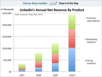
- Where LinkedIn’s Revenue Comes From
- LinkedIn’s Stock Price Over The Last Year – And Then, Today
- Netflix Now Has More Subscribers Than Comcast (And Every Other Cable Company)
Click here to see this week’s charts as a slideshow →
Follow Jay Yarow
Follow Jay Yarow on Twitter
Follow his RSS feed
For the latest tech news, visit SAI: Silicon Alley Insider. Follow us on Twitter and Facebook.