 In May, we analyzed usability guru Jakob Nielsen’s report on iPad design and concluded that it was a welcome return to form for the web veteran. Nielsen and his company have followed up with another excellent usability report, this time about “transmedia” design. It covers mobile, tablets, TVs and even dips a toe into “extreme screen sizes” (very small or very large screens).
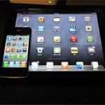
The latest report convincingly argues that although use of mobile devices will dramatically increase, there will still be “much high-value use” on desktop PCs. “One size UI does not fit all screen sizes,” the report somewhat obviously points out. The details though are worth looking at, as it shows how user experiences across devices and screen sizes will increasingly differ.
Article source: RRW http://feedproxy.google.com/~r/readwriteweb/~3/9oB09u7vYwU/designing_for_5_screens_pc_mobile_tv_more.php